
Adjusting Padding and Margin in Elementor while working with a Template Kit is essential for fine-tuning spacing and alignment. Here’s how to do it:
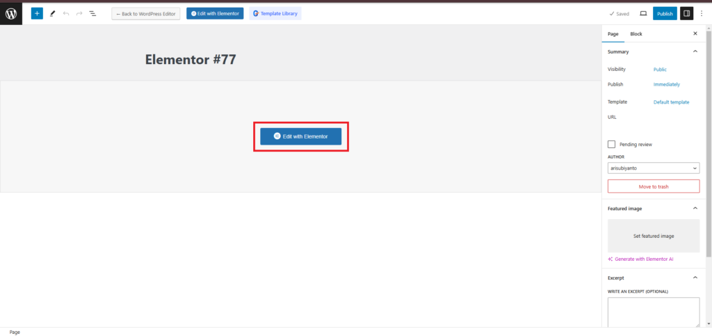
1. Open the Elementor Editor
- Go to your WordPress Dashboard.
- Navigate to Pages > Edit with Elementor on the page that uses your Template Kit.
2. Select the Section, Column, or Widget
- Hover over the area you want to adjust (section, column, or widget).
- Click the Edit Section, Edit Column, or Edit Widget icon (depending on what you’re editing).
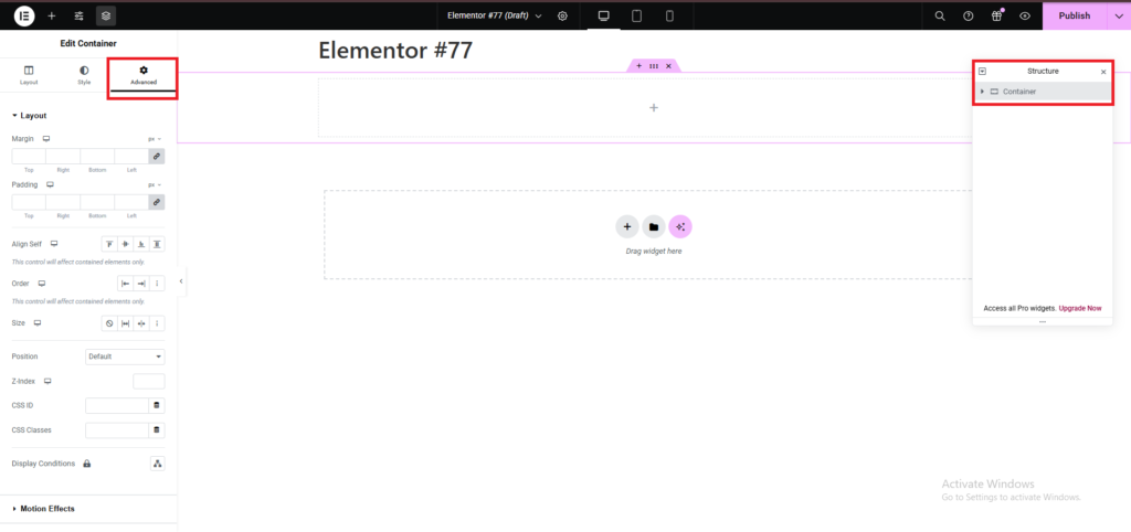
3. Access the Advanced Tab
- In the Elementor panel on the left, click the Advanced tab.
Here, you’ll see options for Margin, Padding, Z-Index, and more.
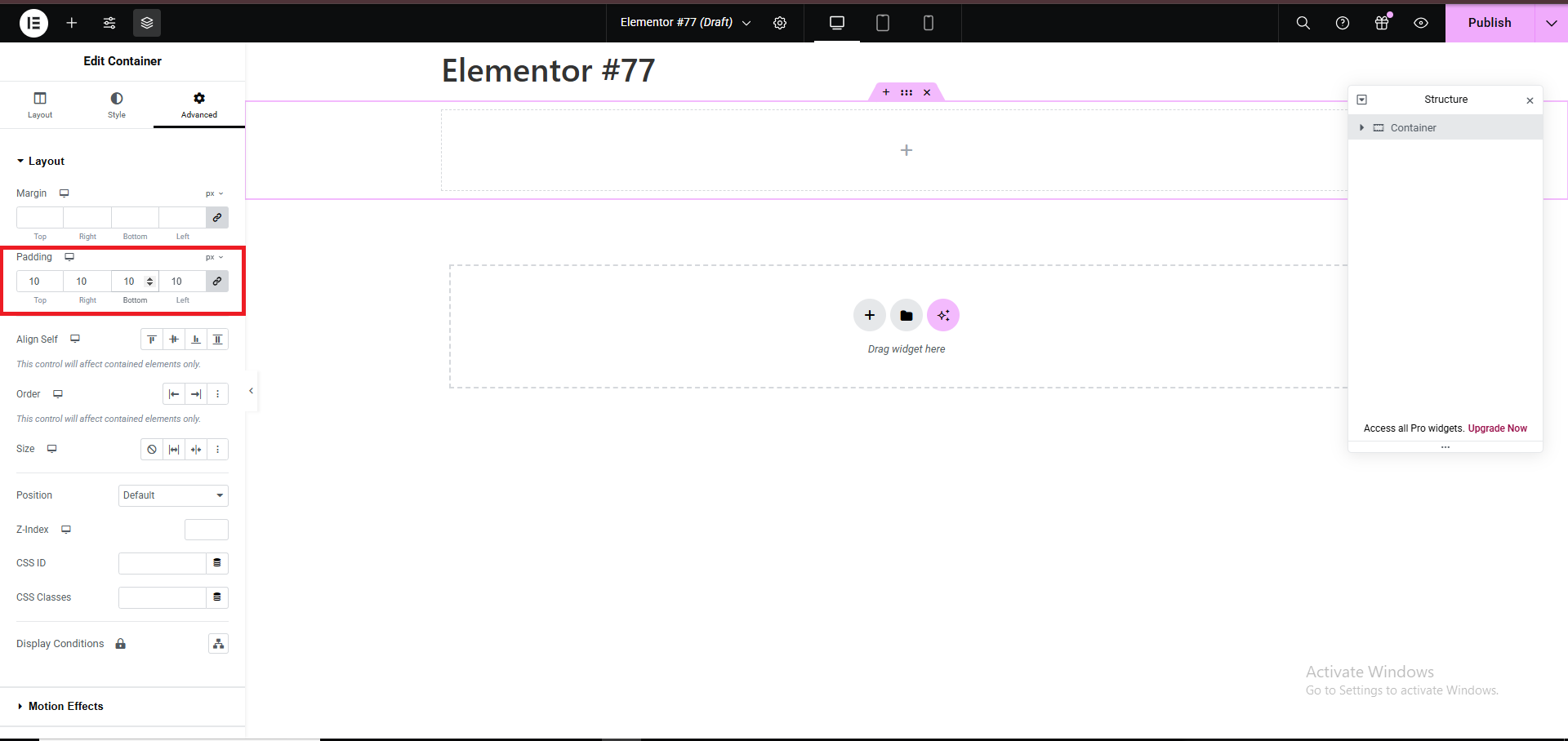
4. Adjust Padding
- Padding controls the inner spacing within an element (the space between the content and the element’s borders).
- Set values for Top, Bottom, Left, and Right.
- Use the link icon to apply the same value to all sides or unlink to set individual values.
Example: Setting padding to20pxwill create uniform inner spacing around the content.
- Set values for Top, Bottom, Left, and Right.
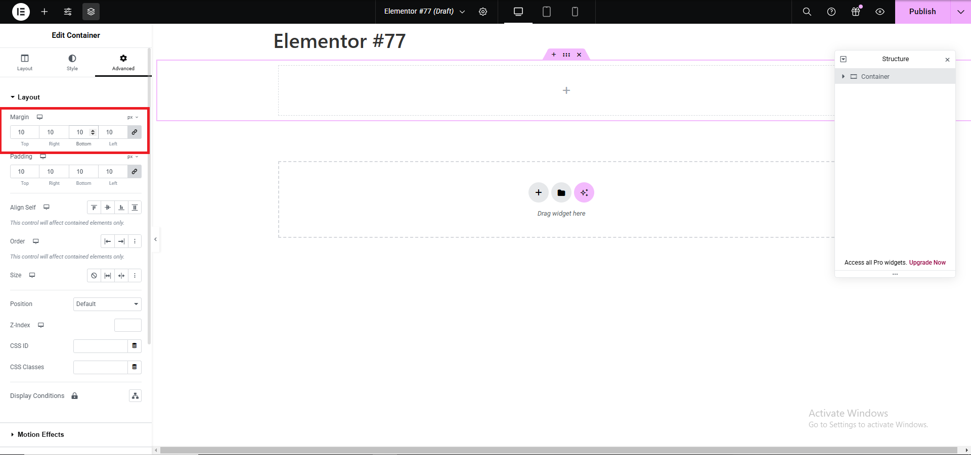
5. Adjust Margin
- Margin controls the outer spacing of an element (the space between the element and adjacent elements).
- Enter values for Top, Bottom, Left, and Right.
- Unlink the sides to set different margins for each direction.
Example: Adding a bottom margin of30pxcreates space below the element.
- Enter values for Top, Bottom, Left, and Right.
6. Use Responsive Controls
- For responsive design, switch to the Responsive Mode by clicking the device icons (Desktop, Tablet, Mobile) in the top toolbar.
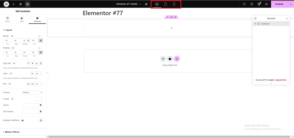
- Adjust padding and margin values specifically for each device type to ensure proper alignment across screen sizes.
7. Preview Changes
- Click the Preview Changes button to see how the padding and margins look on the live site.
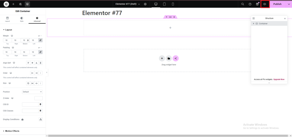
- Ensure the spacing aligns with the overall design of your Template Kit.
8. Save Your Work
- Once satisfied, click Update to save your changes.
Best Practices:
- Avoid excessive padding/margin values to maintain a clean design.
- Stick to the spacing guidelines provided in the Template Kit for consistency.
- Use percentages (
%) or viewport units (vw/vh) for flexible, responsive designs.
By following these steps, you can easily fine-tune the spacing in your Template Kit for a polished, professional look.